

I'm a product designer and a front-end developer based in London, UK. I design and build exceptional products for users and businesses.
My work with SaaS companies dates back to 2018, first starting in marketing and communications. Along the way, I've designed for UK and US startups in B2B fintech, B2C foodtech, tourism, health, flower delivery subscriptions and more.
Get in touch if you'd like to discuss a project.

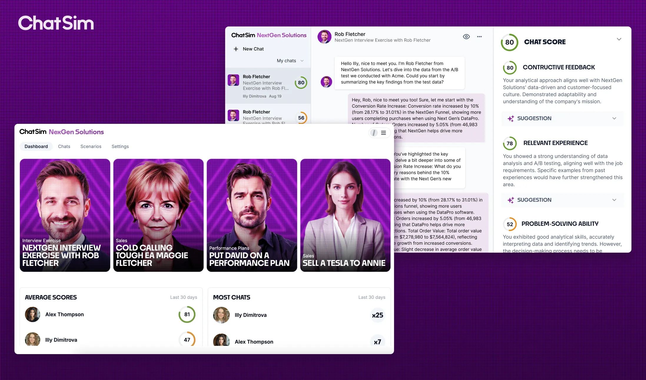
I am designing and building ChatSim, a tool that simulates professional conversations with realistic AI characters and scenarios. After the chat, the user gets personalised feedback for improvement and a score out of a hundred. The goal is to help teams practice work situations (Sales, HR, Customer Service etc.), learn new skills in a fun way and level up. Managers can track impact and measure team performance.

Krokit (HQ in the US) is the financial data management platform for the franchise industry. I came in as a first designer, built two products and helped scale one of them to a five-figure monthly revenue in just two months.


I was part of two 5-day design sprints in London organised by The Craftory VC Fund for Freddie's Flowers. During the first sprint I worked closely with Freddie's and The Craftory VC teams on designing dynamic prototypes for a new 'Gifting' product. We tested the prototypes with real users and the product was released shortly after the sprints. In the second sprint I collaborated with Freddie's branding and executive teams to generate dynamic prototypes for six product dimensions. All designs were again tested with real users from various audience segments to establish the most viable solution.


Practising karate and observing areas for improvement in my club sparked the idea of designing a martial arts app concept. The app facilitates event updates, online payment, and communication among students. Additionally, it assists club owners (Sensei) in managing events, receiving online payments, communicating with students, and maintaining student records.


I designed the site in Figma and built it in Webflow. I chose minimalistic and easy to navigate design for this project. I focused on featuring high-quality visuals of the area to help visitors imagine the experience and make them more comfortable booking online. The site is pretty big and required a lot of CMS collections and compiling the right assets for each section. Hotjar has shown that the scrollable photo galleries are very popular with most users looking at every photo.


I planned and created the branding for an advisory business that works with food and agriculture tech start-ups. I designed all visuals and wireframes in Figma and built the site in Webflow. The new website increased sign-ups by 50%. I worked there as a Marketing Manager and found it quite fun producing two 5-star rated podcasts for them.