Krokit is the financial data management platform for the franchise industry.
What real business results came out?
- Research platform - five-figure monthly subscription revenue within the first two months
- Franchisor platform - Krokit signed up three franchises in the first few months of launch, two of which have 90+ locations across the US
- Multiple feedback from users that the platform is very user-friendly and has a clean design (“I love the tool and the product. I plan on acquiring more and more franchises, so I think I'll be using this tool regularly.“ Krokit Research Platform user)

User Feedback Survey for Krokit Research Platform
What did I work on?
As the first and only designer in the company, I established a design process and created the design language. My process involves five main stages:
- Discovery - competitor analysis, user research and stakeholder interviews.
- Ideation - brainstorm, strategise and asses each idea, using Figjam and Figma for planning and designing initial screens and user flows.
- Design - collaborative iteration, incorporating feedback before moving to the proposal, and cross-functional collaboration for development.
- Build - supporting developers with development and testing.
- Review - user feedback and ensuring features had the impact we'd hoped.
1. Research Platform
Problem
Before buying a franchise, aspiring franchise owners need to research a bunch of franchises and sieve out the most promising ones. Aspiring owners struggle to find one place to do their due diligence and end up paying huge fees to franchise brokers and consultants for the initial research and franchise information.
Solution
We developed the Krokit Research Platform, aiming to consolidate the most comprehensive franchise data available, setting a new industry standard.
During my time at Krokit, I collaborated closely with the CEO, who is well-known in the franchise industry as The Wolf of Franchises. This helped me gain deep insights into the franchise sector and our user base.
After research, I learnt that aspiring small business owners are not proficient in reading and understanding complicated data. I chose a clean and minimalist feel for the platform to make it easy for users to see each brand and scan through data points quickly.

Research Platform - search and save franchises
To enhance user navigation, I integrated filters, allowing users to refine their searches. A seemingly minor yet impactful UX detail was deciding to open each brand summary page in a new tab, significantly improving the browsing experience.

The ability to compare franchises proved very useful to users. This feature helps them select two franchises side by side and easily scan through their most important metrics.

Research Platform - search and save franchises
2. Franchisor Platform
Problem
Franchisors need to see all franchisee financial data in one place and understand each location's performance so they can make adjustments to grow the business.
Solution
We developed Krokit for franchisors which helps them manage all their franchisee data in one place; and for the franchisees on the other hand (small business owners), to easily see their accounting data and compare their performance to other locations in the franchise.
Building this product included chatting with CFOs, designing graphs, income statements, and balance sheets so I had to get my accounting chops up to speed.
There were a lot of challenges along the way, for example, the onboarding flow and franchisor data sharing. I am not sharing these learnings publicly due to company privacy.

Banking dashboard for franchisees

Income Statement Report for franchisors
What were the challenges?
Onboarding flow
Initially, the onboarding flow for the franchisor had a step where they needed to add their Chart of Accounts one by one. We were working on an example for a chart of accounts that only had ten accounts so I designed for that.
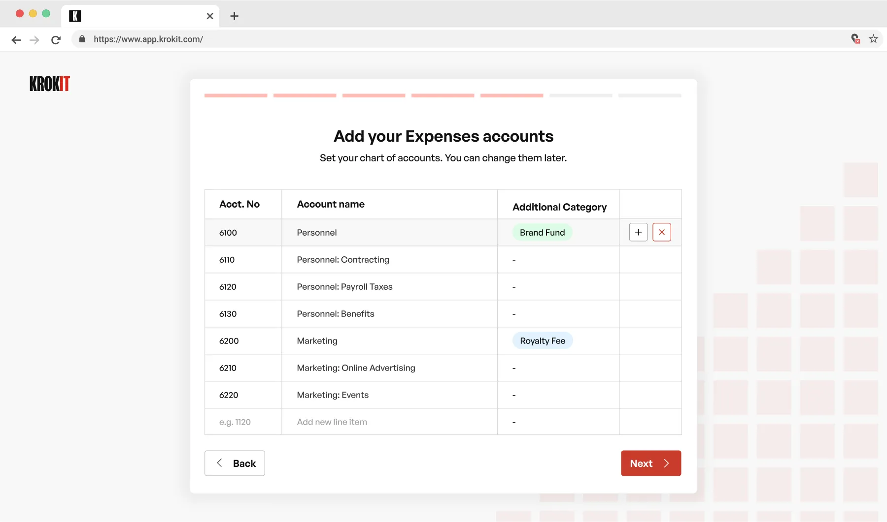
It became tedious to enter many accounts manually
When the first franchise client came, they had fifty accounts! So during our testing, we realised that this would be a significant job for the user (lots of data input and typing) and would add friction to the onboarding flow. We decided to simply let them upload a CSV with their accounts to speed up the process.
💡 Lesson: I learnt the importance of designing based on realistic data.
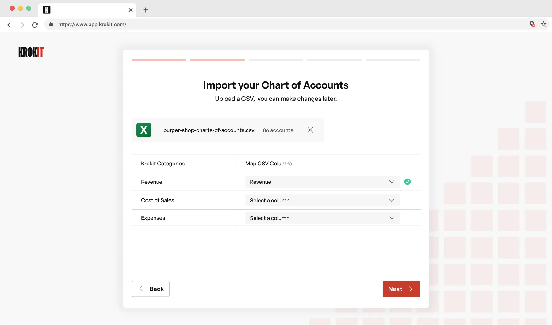
CSV uploader made things easy
Franchisees hook up their accounting tools, such as Quickbooks, to Krokit through
Rutter. Then, imagine the headache for franchise HQ having to sort through and manually map
accounts for over 100 locations, picking each account from a dropdown list.
To simplify things,
we tapped into the OpenAI API and created an AI-driven mapping tool. It finds the account name
that matches the closest and lets the main company link it up with just a single click:
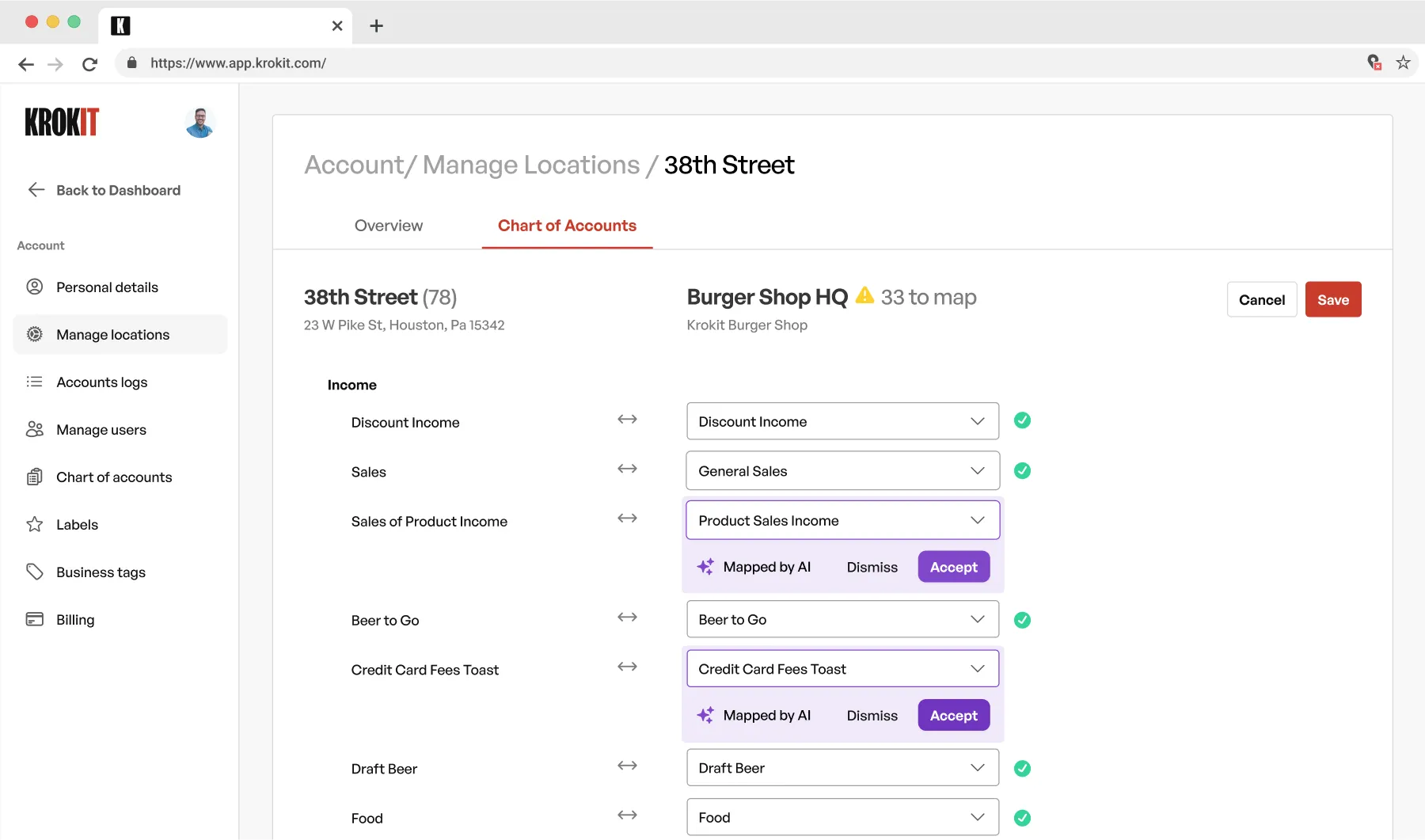
AI accounts mapping feature
Franchisor data sharing
When our first franchisor came on board, the franchise was all behind it, we had a
call with the CEOs of the franchise and everyone seemed ready to go. After a few days, only a
handful of locations onboarded. The franchisor themselves were surprised. We instinctively
turned to the product - where was the problem? How can we improve the screens? Reduce clicks and
friction?
We launched some research calls with successful franchisees - they were open and interested
and gave us some tips. We shipped a few iterations like the 'benchmarking' feature (which allows
franchisees to measure their performance against other locations); also perks such as discounted
business insurance and loans, a partner network and so on. However, nothing seemed to help much.

Research calls with franchisees
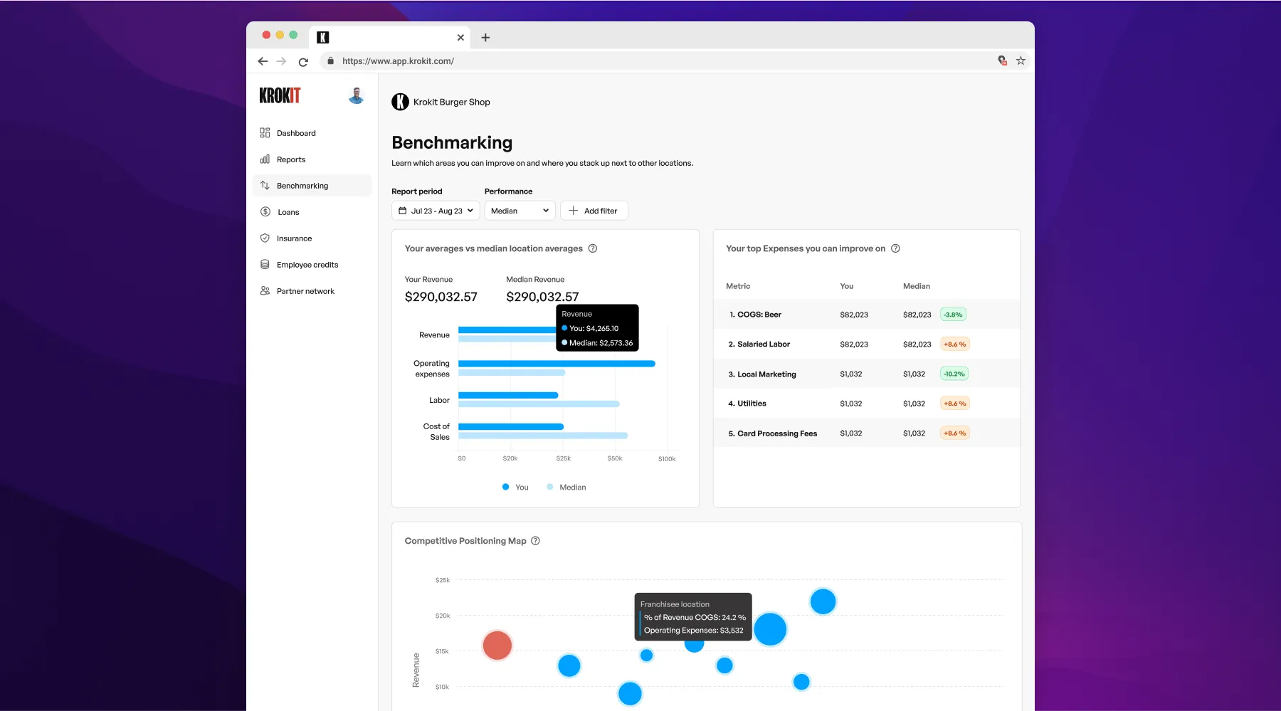
Benchmarking feature
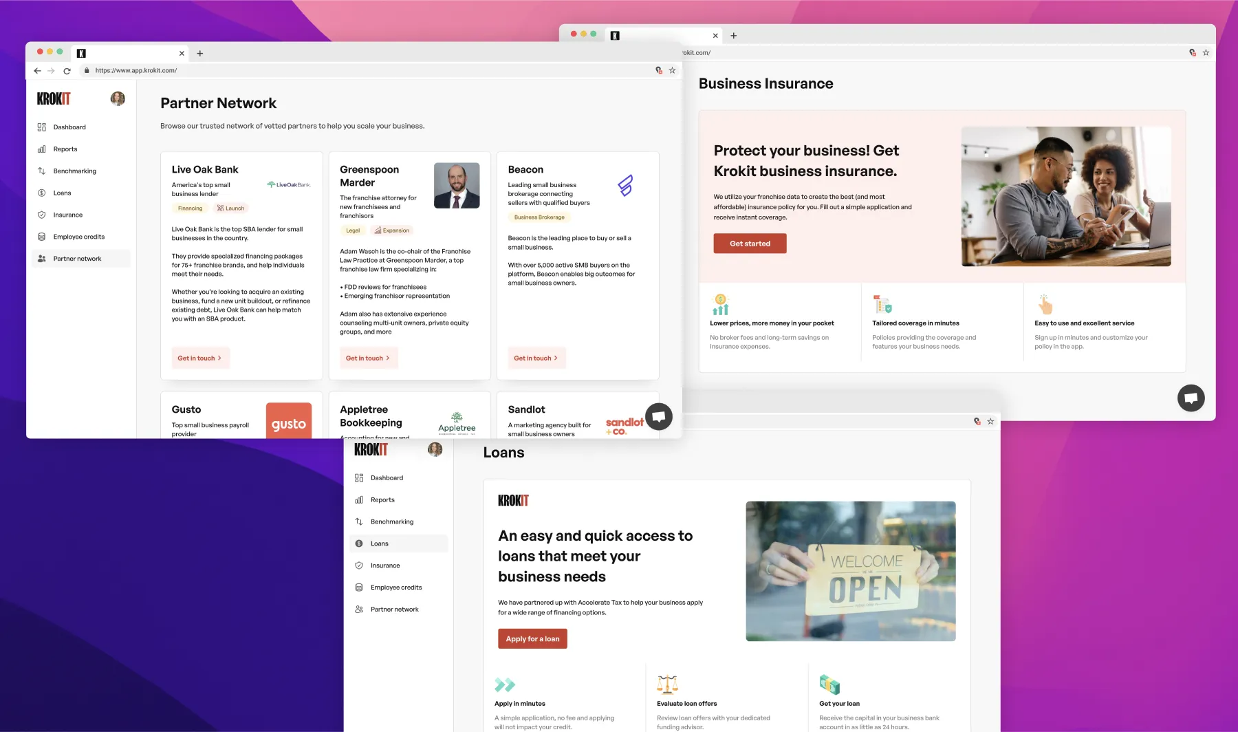
Extra perks for the franchisees
During the onboarding call with our second client (over 100+ locations), we had some
vocal franchisees. We began asking more 'why' questions and they began to push back on the idea
of sharing their data with the franchisor. The more we dug into this, we realised we were in the
middle of a dynamic of slight mistrust between the franchisees and franchisor HQ. We understood
that franchisees were nervous about sharing their books with HQ - maybe some creative work had
happened here?
We built a feature during onboarding to let franchisees select a date to begin sharing
their accounts - so they could begin fresh with books they know are going to be transparent and
visible to HQ.
💡 Lesson: Sometimes the biggest insight is something nobody will tell you directly - you have to ask the right questions and look between the lines.
What did I learn?
During my time at Krokit and the diversity of the users for each product, I learnt a lot about the motivations of each user group and how each flow should be tailored to that specific user segment. Being able to get hands on with front end development really speeds up the building process. This experience also honed my collaboration skills and I thoroughly enjoyed working in a multi-cultural product team distributed between the US and the UK.


